

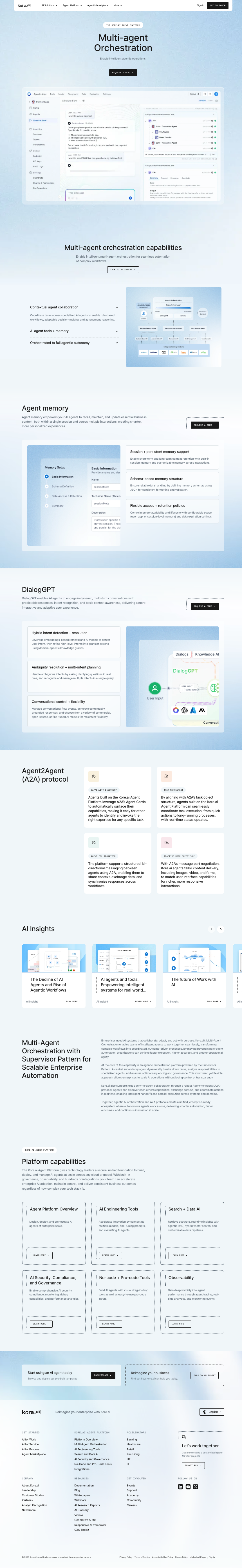
Context
Kore.ai is an enterprise-grade, no-code and agentic AI platform adopted across industries such as banking, healthcare, and telecom, and by Fortune 500 organizations including UnitedHealth, Citi, and AT&T. Model-agnostic and multi-channel, it integrates seamlessly with existing technology stacks like Salesforce Service Cloud and ServiceNow, with a focus on end-to-end orchestration and measurable ROI. Recognized consistently as a Leader in analyst reports — including Forrester Wave™ (Cognitive Search) and the Gartner® Magic Quadrant™ (Conversational AI Platforms) — the Kore.ai brand required a scalable system to support continued growth and user adoption.
At Kore.ai, I led design and brand systemization initiatives across multiple digital platforms, enabling thousands of internal contributors and supporting large-scale usage aligned with product growth and global market expansion. That work spanned in total two design systems (stabilization → scale) and three brand realignments (stabilization → refinement → future positioning.)
Outcome
The effort resulted in a fully integrated design system that established a semantically sound (for potential, future LLM assisted asset creation) source of truth across product and marketing surfaces. Design tokens and component families were standardized at the aforementioned semantic level for ease of use and understanding, while concurrently structured for code (tailwind CSS), ensuring parity between design and development. The system’s atomic based modular architecture enabled designers to rapidly prototype in mid/hi-fi while maintaining accessibility and compliance standards. In tandem with an ever-evolving & living systems handbook to reduce grey areas, these improvements not only accelerated design-to-development velocity but also created a scalable foundation. Future product experiences and site refreshes could seamlessly inherit the same design logic. The transformation elevated Kore.ai’s brand perception, aligning visual and functional quality with its enterprise positioning as an industry leader.

43% faster UI build time after implementing the tokenized design system — cutting page assembly from hours to minutes in some flows, for design and development. (Benchmarked against IBM's Carbon Design System & in-house audit.)

65% fewer merge-conflicts and visual QA tickets after Figma and code components were aligned along to a Tailwind CSS standard. The utility-first mindset of the framework also reduced an incalcuable amount of frustration for development sprints.

72% reduction in off-system variants across core layouts and components, improving brand coherence and developer hand-off accuracy within the first months of roll-out. WCAG color compliance also rose from 38% to 91% in automated tests.
This design system (or these systems were) was crafted in parallel with a brand voice re-alignment and refresh, which contributed to increased traffic, improved conversion rates, and higher-quality leads. While this is the subject of a separate case study, the two initiatives worked together to strengthen the Kore.ai brand and reinforce its market leadership. I refer to this as one design system, but in reality you're seeing two, with the precursor system shown in research. The first (shown in "Research") was born out of an audit to solve a "wild west" problem of one platform looking completely different between products and pages. The second, was crafted to scale, being built in partnership with an information architecture revision.


Problem
Despite Kore.ai's recognition by industry analysts and adoption by major enterprise clients, the user experience lacked cohesion across all touch points. Rapid product expansion, paired with parallel brand evolutions, had led to drift: inconsistent layouts, divergent UI patterns, and redundant bespoke work across web and product. The result was friction for contributors and mixed signals for both current and prospective clients. The primary challenge became clear, that is, to restore platform coherence without slowing release velocity.
In short, there were too many styles with too many interpretations. The experience felt like multiple companies coexisting within the same marketplace. With no true design system in place, just loosely defined and constantly shifting brand standards — a ground-up build was required. The lack of alignment and redundant work were eroding efficiency, wasting time and money, and undermining confidence.


Process/Research
The first phase centered on discovery and mapping the existing design ecosystem. Every product surface, landing page, and interactive component was audited to identify recurring patterns, redundant variants, and opportunities for consolidation. That consolidation led to the stopgap design system that was crafted to stop the bleeding (shown below), so to say, and stabilize the brand as we entered into a large branding refresh. Cross-functional interviews with design, engineering, and brand teams uncovered handoff and maintenance bottlenecks. Accessibility and performance benchmarks were captured to set a compliance baseline, while stakeholder feedback highlighted usability and consistency issues. Together, these insights ensured the second stage design system would resolve inefficiencies and deliver meaningful improvements in visual quality and user experience improvements. One added issue was uncertainty of how AI would interface with this system, which may sound odd in as of now, very early 2026, but the process began before Figma even had variables, let alone UI interface generation tools being feasible workflow options.


Process/Design
With insights from the audit, the design phase focused on constructing a token-driven system for adaptability and longevity. Color, typography, spacing, motion, and other foundations (interactive example below) were defined to establish scalability across product lines and environments. Components were redesigned with accessibility, clarity, and modularity in mind, ensuring that complex interaction patterns such as chat flows, dashboards, and admin settings shared a unified visual and behavioral logic. Reducing discrepancies and eliminating significant manual rework is the goal of many systems, and that was no different here. Governance documents were an unsung hero in allowing design & engineering to have a functional, shared language as we moved into growing instances of designers shipping code, and development engaging in design thinking.


Process/Validation
Validation combined quantitative and qualitative measures to ensure durability and effectiveness. Time studies with design and development teams measured assembly times of key interface types before and after implementation, while accessibility tests confirmed WCAG AA compliance across core elements. Real-world validation included live deployments of page templates and product modules, with engagement metrics and session replay data showing measurable improvements in consistency and comprehension (also supported by the earlier brand realignment). Feedback loops with engineering, marketing, and product teams informed refinements to token logic, removed redundancies, and strengthened long-term governance. All of this existing to serve one of the business end goal of being consistently ranked highly by users for easy to digest solutions and interfaces a proper design system allows.


Wrap-Up
Figma's Variable system was released mid-system design. While the design system was set up with development in mind, reworking and rethinking the Figma system was still necessary given the importance of minimizing issues while maximizing efficacy as Figma was the designated source of truth. Figma, LucidChart, Notion and Tailwind CSS were some of the tools used in conjunction with collaboration across product and web (5 designers), development (4 developers), and other teams and stakeholders inferred from above.
The experience with this particular design system influenced my direction in future projects to create headless design systems that lived outside of a design program. Figma was a facetious source of truth that worked due to stringent documentation. A true source of truth could be deployed anywhere, transliterated and translated as needed, pushed to Adobe, Figma, Framer or Webflow, Github and beyond. Some fiction in design, the ability to pause and think, I'd argue is important but only when that friction isn't frustrating. And, well, we certainly did not remove frustration, even with the numerous improvements, in any system during this time. Either/Or…whenever that case study is live, and I don't forget that I made this statement, I'll drop a link here.